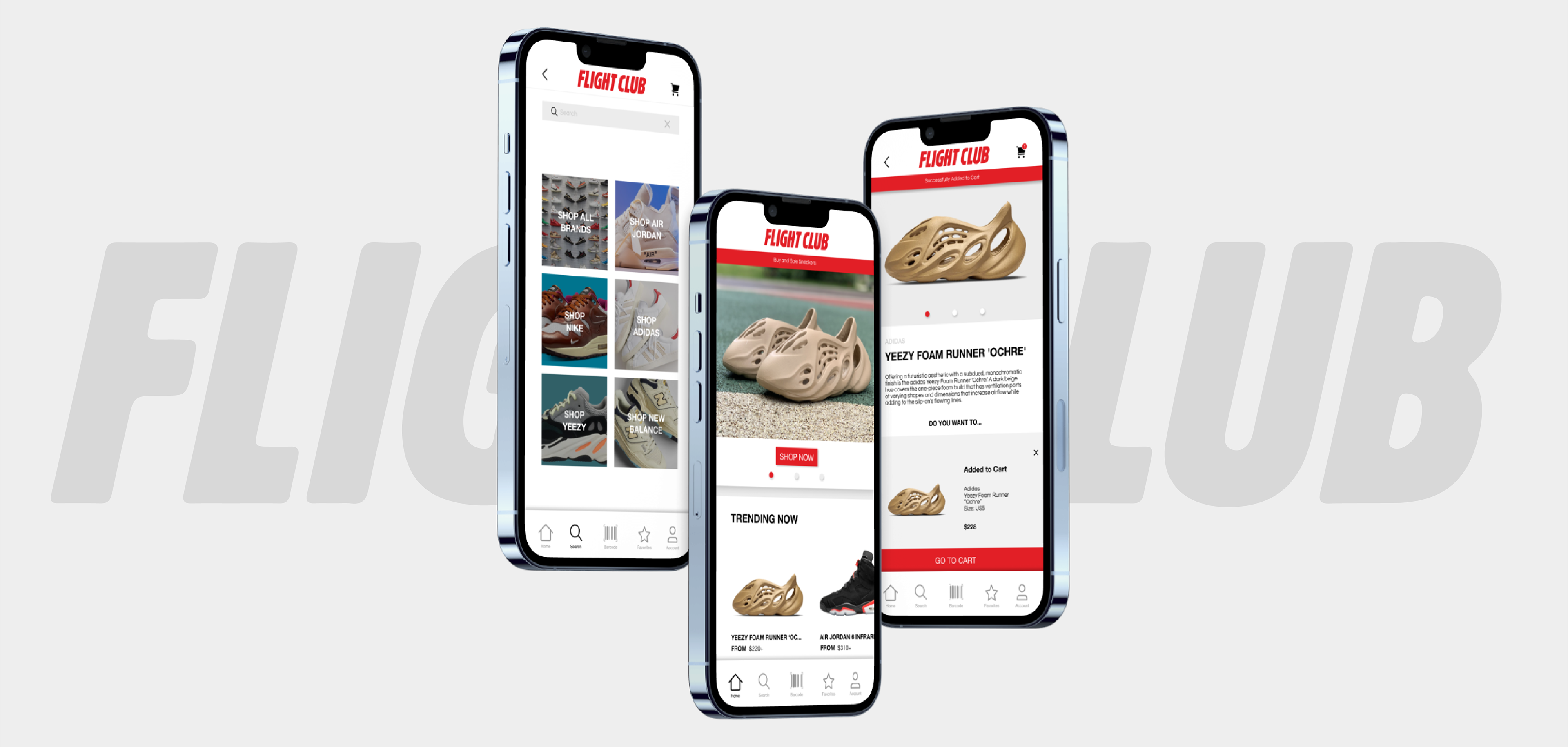
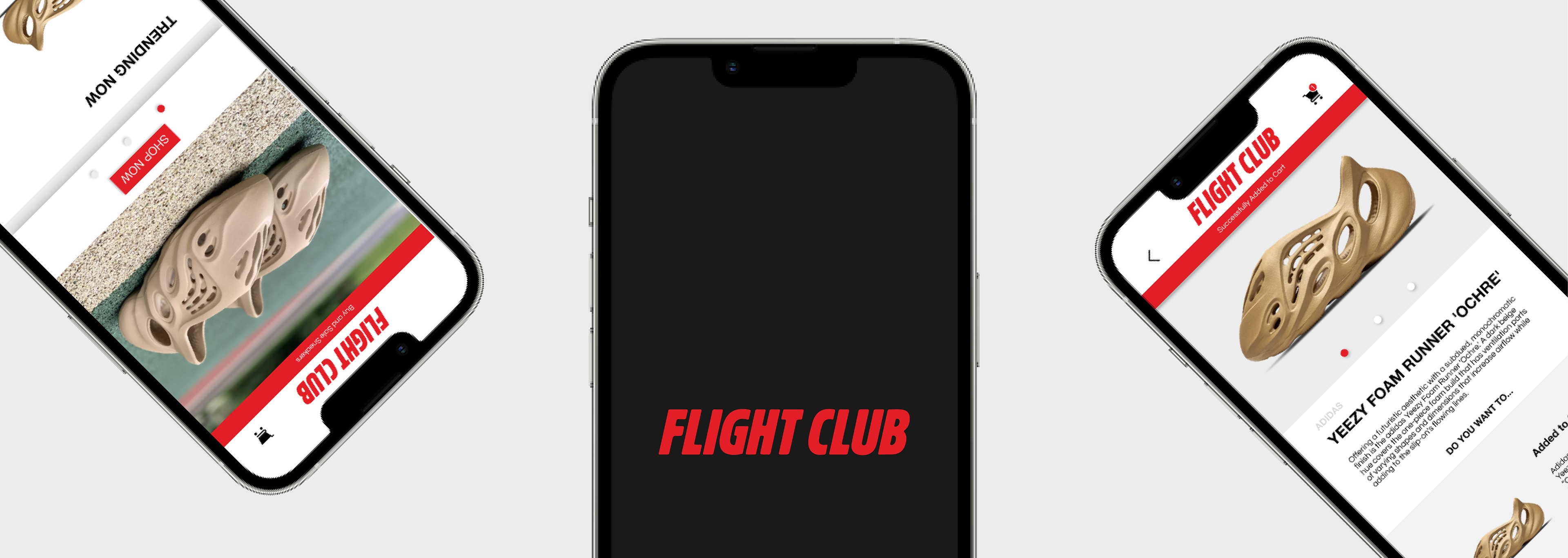
THE PRODUCT
Flight Club is a sneaker retailer and the original consignment store for rare shoes. Flight Club are looking to create an app to attract new and existing customers and grow on a larger audience through having a bigger online presence. Flight Club targets customers who want to buy or sell their rare sneakers.
ROLES AND RESPONSIBILITIES
UX designer, designing an app for Flight Club from conception to delivery.
Conducting interviews, paper and digital wire framing, low and high-fidelity prototyping, conducting usability studies, accounting for accessibility and iterating on designs.
PROJECT DURATION
February 2022 to August 2022
THE PROBLEM
With the growing trend of sneakers not all consumers are able to buy the products that they desire. Also there is a lack of trust when selling products.
THE GOAL
Design an app for Flight Club that allows users to easily buy and sell sneakers that they desire.
USER RESEARCH SUMMARY
I conducted interviews and created empathy maps to understand the users that I am designing for and their needs when using the product. A primary group that was identified through research was young adults that want to buy and sell exclusive sneakers.
From the research, insights were revealed that users lack trust when buying from other consumers. Other problems included them not knowing the sneaker market.
USER RESEARCH: PAIN POINTS
Time
Busy consumers do not have the time to go through the rigorous process of buying sneakers at retail.
Financial
Sneaker resellers do not have the trust when selling their products amongst each other.
Support
Not all consumers know about the sneaker market and the products that they are buying and selling.
IA
Text heavy apps are often difficult for users to navigate.

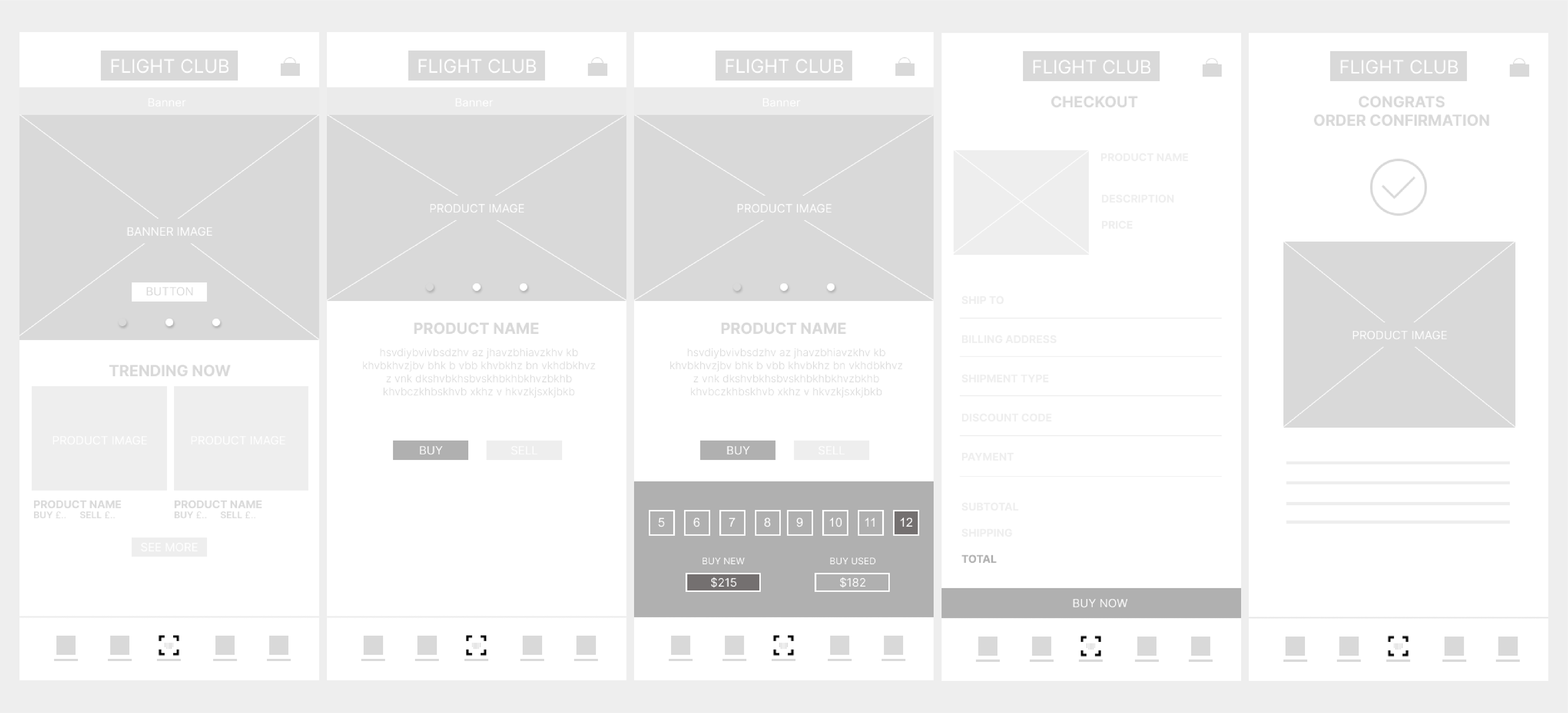
DIGITIAL WIREFRAMES
After sketching out some paper wireframes and thinking through the preliminary flow, I reviewed what was both necessary, and unnecessary, and continued to work on areas of improvement. A lot of time was spent on this stage to make sure that the user would have a good experience before moving onto the visual interface.
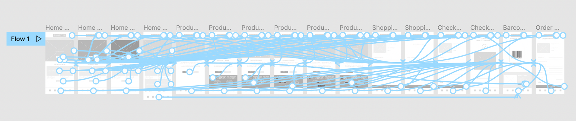
USABILITY STUDIES
I conducted two rounds of usability studies. Findings from the first usability study helped assist the designs from wireframe to mockups. Then the findings from the second study using a high-fidelity prototype revealed what aspects of the mockups needed refining.
ROUND 1 FINDINGS
1. Users need a way to go back.
2. Users need visibility of the product price, before being taken to checkout.
3. Users need the product to be added to the cart.
4. Users need confirmation page before checkout.
ROUND 2 FINDINGS
1. Road block in ordering, users was unable finish off the purchase.
2. Menu icons were too small.
ITERATIONS
From conducting the usability study I was able to gain a better understanding of the changes that the users needed to make their experience better.
3 out of 5 participants would like the option to be able to go back.
Users were frustrated that you had to go back to the home page rather than having a back button.
"I would like a back button so I don’t have to back to the home screen."
3 out of 5 participants were confused regarding the product pricing.
The users shared frustration when the price was not visible.
"The price of the shoe also does not show up."
2 out of 5 participants were confused that the product was not added to the basket before checkout.
Users felt deceived when product went straight to checkout.
"I think I should be able to click the shopping cart to take me to checkout as I would have to keep on going back to the home screen if I want multiple products."
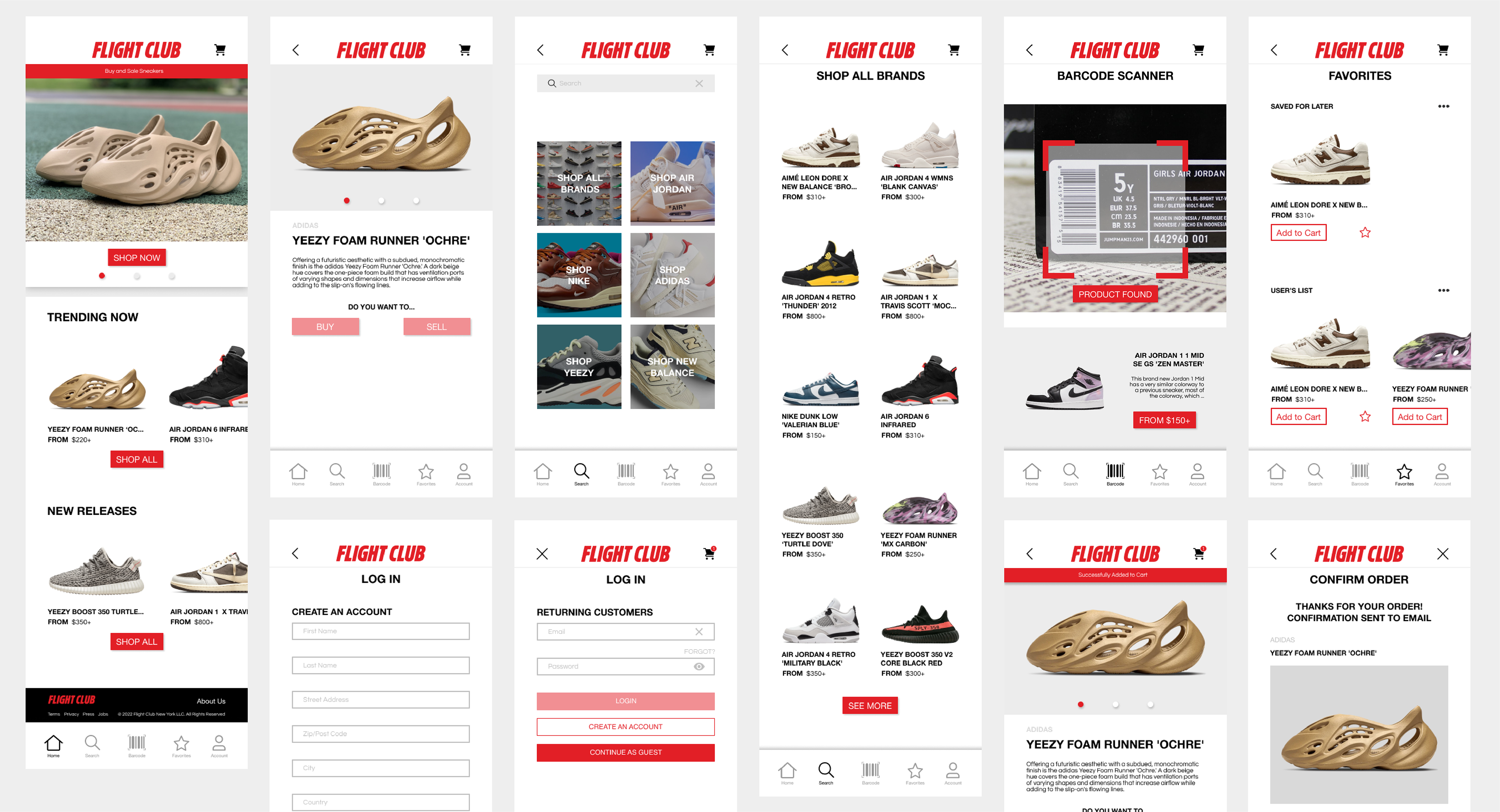
The final high-fidelity prototype presented a simple, clean user flow for users to be able buy and sell sneakers. The product also met the end users need being easy to understand and being quick to purchase.